Brand Identity
Billy Butterfield's Ice Cream Emporium
Billy Butterfield’s Ice Cream Emporium aims to have the overall tone of the brand to be a
light-hearted, yet classy and cozy place which is always family friendly and inclusive to all.
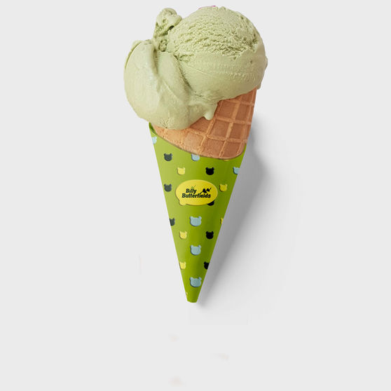
The color palette I have selected was used following the core theme of nature. In order to maintain brand alignment through the entire design process the colors I included will
be a half mono-chromatic color scheme of a few different greens which reflect the nature aspect of the brand along with a bright yellow pop of color in order to create contrast and bring attention to the brand.
The logo I created for Billy Butterfield's is a plant branch that was initially created from the two B's the name, which then inspired a leaf that almost resembles a heart shape. This logo was created with the brand's nature theme in mind, as well as it's core driver's -the sense of enjoyment people will receive from choosing Billy Butterfield's.

PICK YOUR FLAVOR
Driver's
Billy Butterfield’s Ice Cream Emporium aims to offer innovative and unique ice cream flavors that are of very high quality and consistent in every bite. Billy Butterfield’s aims to be a memorable experience for every customer that they can enjoy at any and every age.


